ICONS rebranding
Concept and identity for a European organisation
2019-2021 | Identity, Motion, UX/UI/web
ICONS is a leading nonprofit organisation in science communication, social and business innovation, with more than 20 years of experience in developing EU-funded research projects.
In 2019, the organisation started a rebranding process to clarify its brand architecture, harmonising all the legal entities, departments and activities under a single brand.
The project involved a multidisciplinary team and took almost two years in the making, from field research to the application of the identity system on all the major touchpoints.
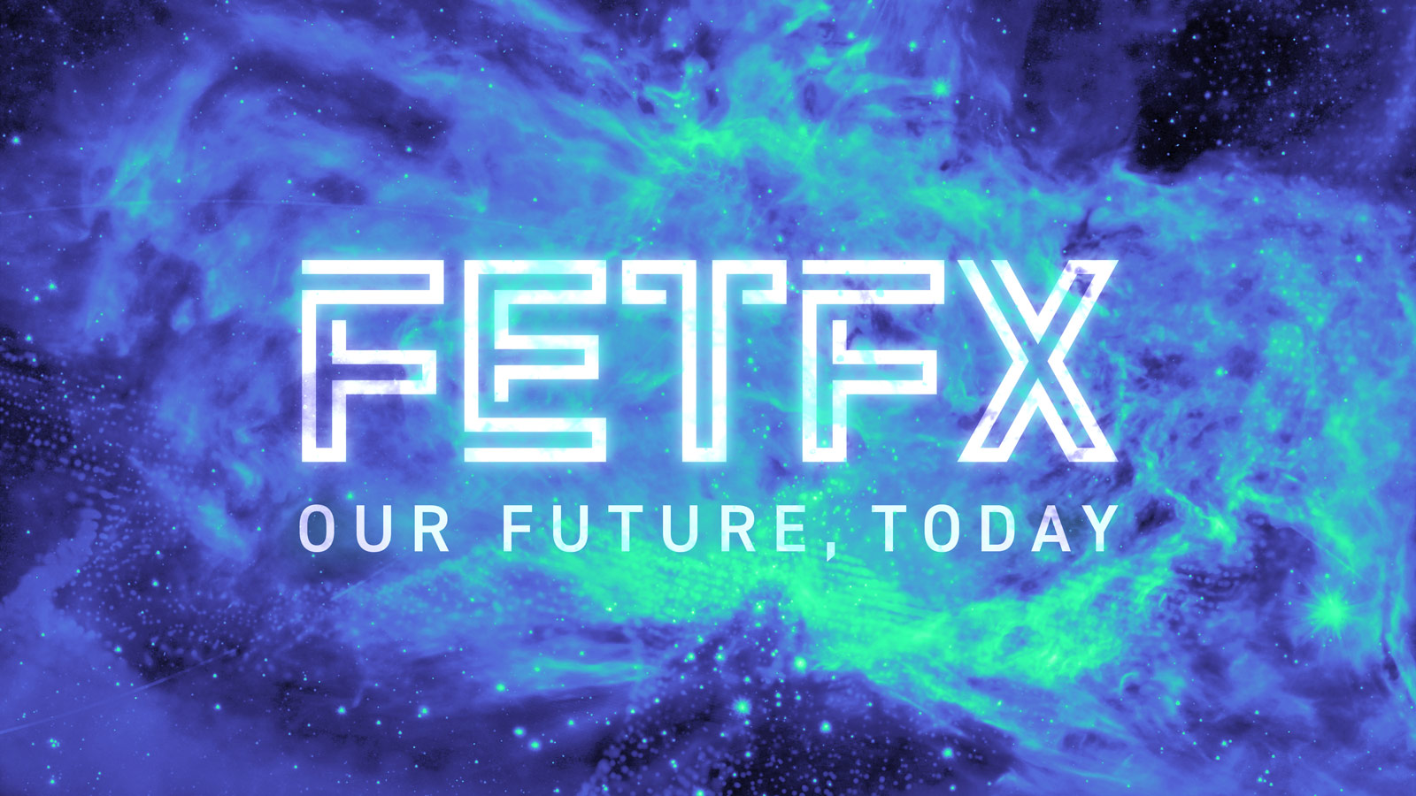
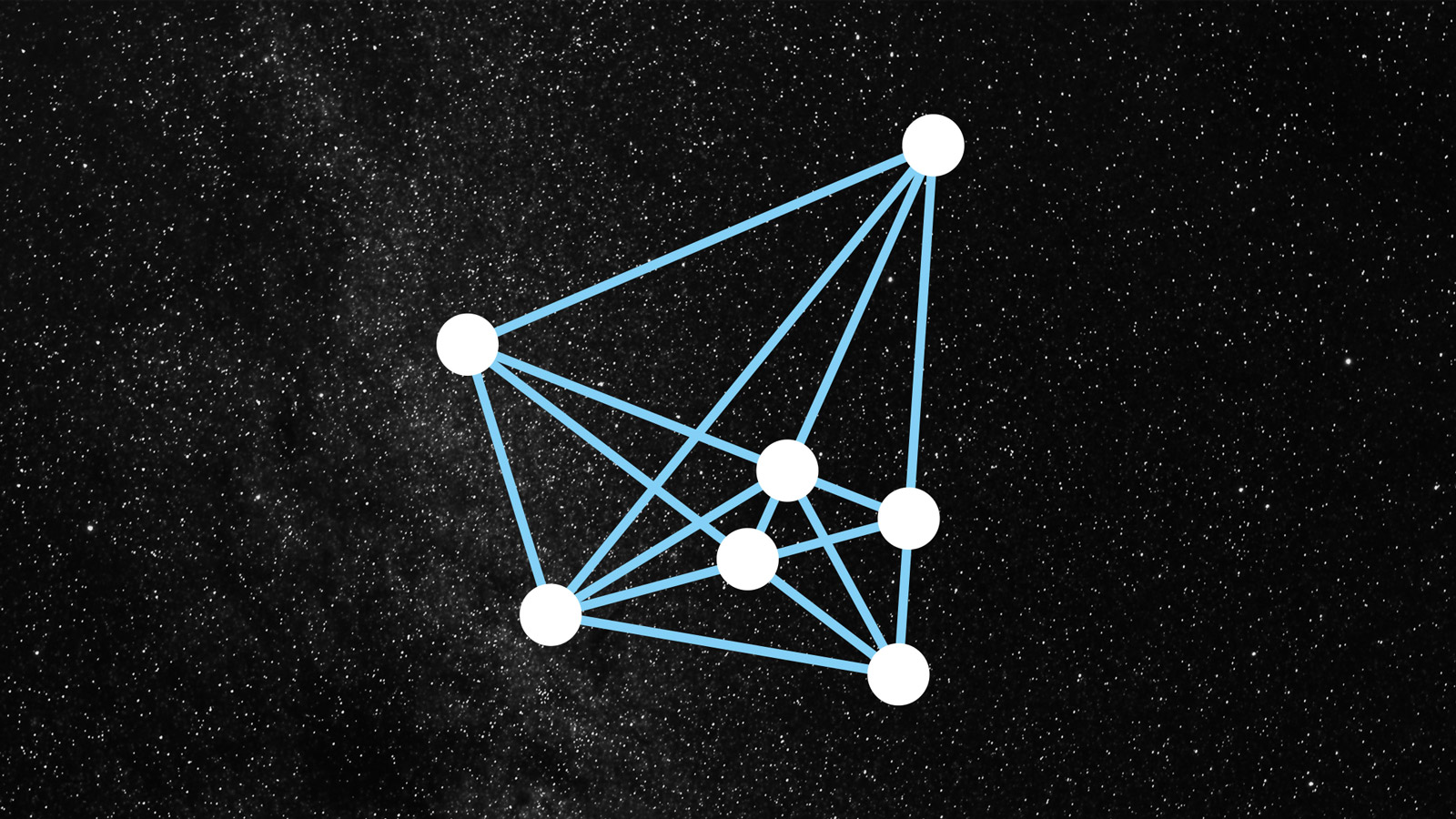
In line with ICONS’ open view of culture, inspiration for the brand identity concept came from a multitude of sources, including music, astronomy, history and biology.

Short video presenting the new identity concept, inspired by the words of Carl Sagan. Motion graphics by Ilaria Abbondanti Sitta
Visit ICONS website to learn more.